Type: Self-directed concept project
Role: Product design
Tools: Claude Design, Figma Make, Figma
Year: 2026
Role: Product design
Tools: Claude Design, Figma Make, Figma
Year: 2026
Summary
Someone close to me lives with Type 1, so I've watched how diabetes is managed. It’s a lot of work and there’s a frustration of doing everything right and still not knowing why a number went where it went.
Most diabetes apps are built around logging. For someone managing Type 1 with a CGM and a pump, the number tracking is done through individual manufacturer apps. Current diabetes apps on the market bring all of these numbers in one place to visualize and offer additional data points to collect in a generalized way, which is helpful but often leads to a lot of work and a lot of data, but not as much understanding or change in behavior.
On my health journey with calorie-counting apps, I learned that asking a person to hand-log data only makes sense if the logging buys them a specific answer they want to know. For me, I did not collect what didn't seem to matter to me or my goals. My concept with Fieldnote is giving people a specific answer tied to the exact data they are collecting, and time boxing the effort.
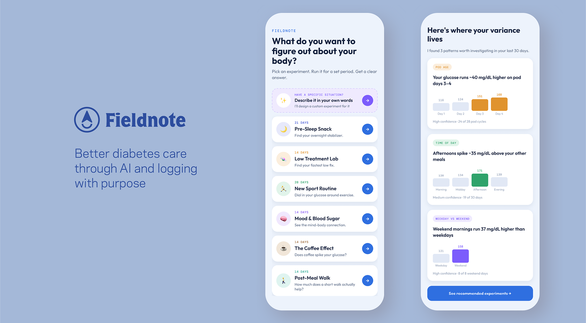
Fieldnote runs structured self-experiments for common problem scenarios. It reads the data you already have in Dexcom (blood glucose) and Omnipod (insulin delivery), finds where your variance is coming from, and turns each pattern into a short, single-variable experiment with a hypothesis, a defined logging protocol, and a resulting suggestion at the end. When you see your endocrinologist, it compiles what you learned into a clinical summary. I designed four flows: AI onboarding, the experiment library, the daily check-in loop, and a clinician handoff.
The pivot
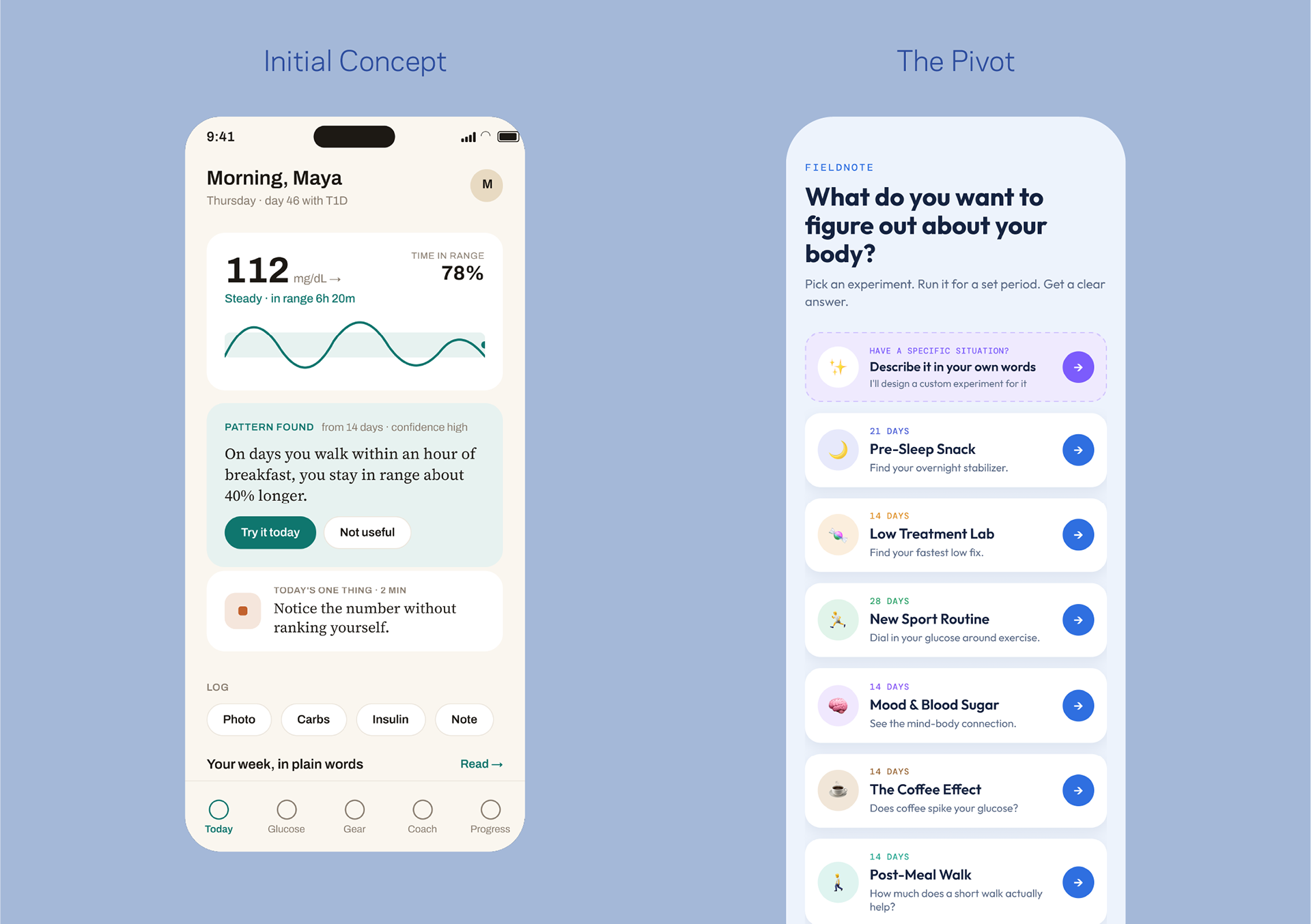
At first, I envisioned a diabetes app that was a mix between Noom and a clean logging app. I quickly mocked up a prototype in Figma Make and built out flows far enough to see the problem: it had potential to be better designed than apps out there, but it wasn't more useful. It didn't really solve a problem. Things were logged, data was shown as a chart or big number, and the burden of deciding what to do was left on the user.
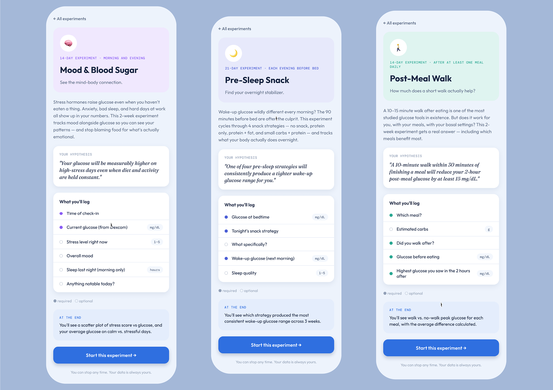
My eureka decision was to stop designing a place to combine and log data and instead provide reasons to collect it. The home screen changed from a glucose graph, which is what all diabetes apps have, and instead asks a question, "What do you want to figure out about your body?", and shows a list of experiments you can run aka "the experiment library".
Logging app (initial concept, existing apps) vs. Fieldnote (the pivot, my concept)
• Log continuously, forever vs. Log for 10–28 days, then stop
• Capture everything vs. Capture only the variables the question needs
• Charts/numbers you have to interpret vs. A clear suggestion
• Success = streak retention vs. Success = you finished and learned something
• Capture everything vs. Capture only the variables the question needs
• Charts/numbers you have to interpret vs. A clear suggestion
• Success = streak retention vs. Success = you finished and learned something
The system
1. Onboarding: find the variance before asking for any effort
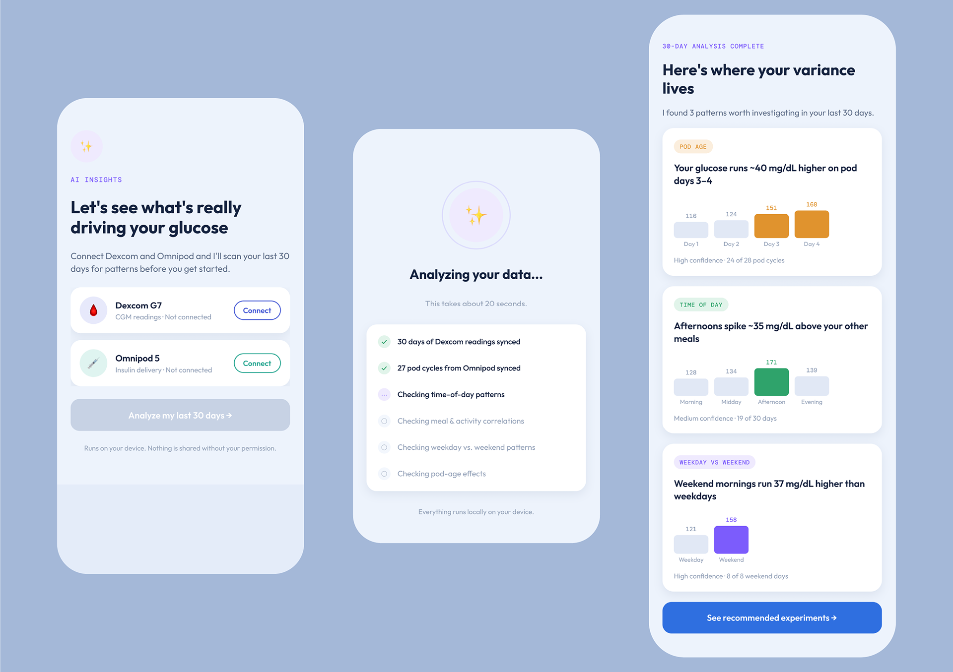
Rather than an empty log, onboarding connects Dexcom and Omnipod, scans 30 days of existing history, and reports back where the variance actually lives. For example, glucose running ~40 mg/dL higher on pod days 3–4, afternoons spiking ~35 mg/dL above other meals, weekend mornings running 37 mg/dL above weekdays.
Because it is health data being analyzed via AI, the results carry explicit confidence labels tied to the sample. For example, high confidence is 24 of 28 pod cycles or medium confidence is 19 of 30 days. Thus the user can weigh a strong signal differently from a weak one. And the analysis screen states that processing runs on-device, at the moment the user is deciding whether to hand over three months of health data.
2. Onboarding: recommend experiments that show their work
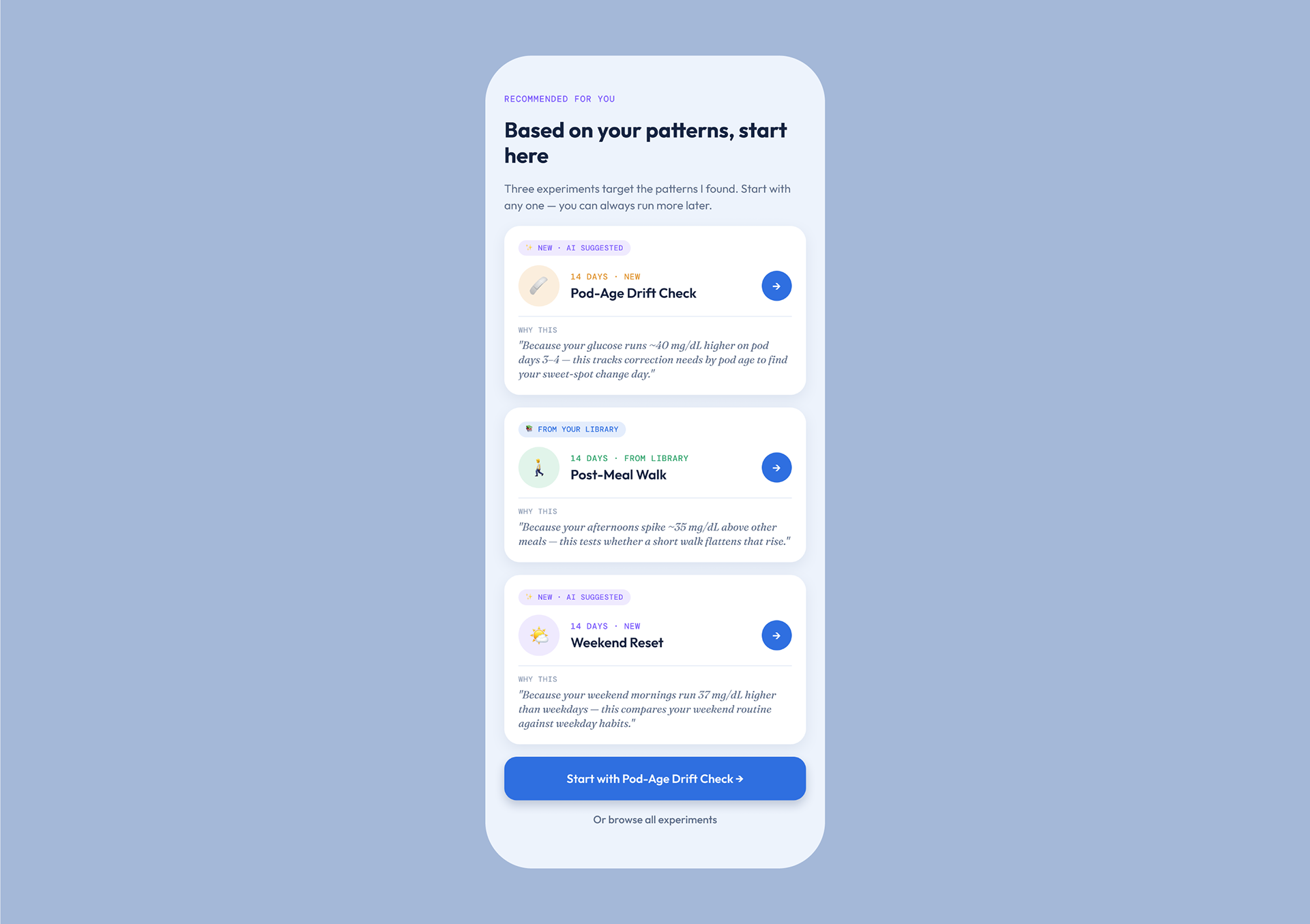
AI recommends experiments based on their last month of data. Each recommended experiment carries a "WHY THIS" block quoting the specific finding that produced it: "Because your glucose runs ~40 mg/dL higher on pod days 3–4 — this tracks correction needs by pod age to find your sweet-spot change day."
3. Commit to a hypothesis before collecting data
Every experiment detail screen states the hypothesis as a sentence the user is agreeing to test, and states what they'll see at the end, before they start. Required and optional fields are marked with filled and open dots, so the user knows the minimum bar for a valid day.
4. Make the daily loop small enough to last 21 days
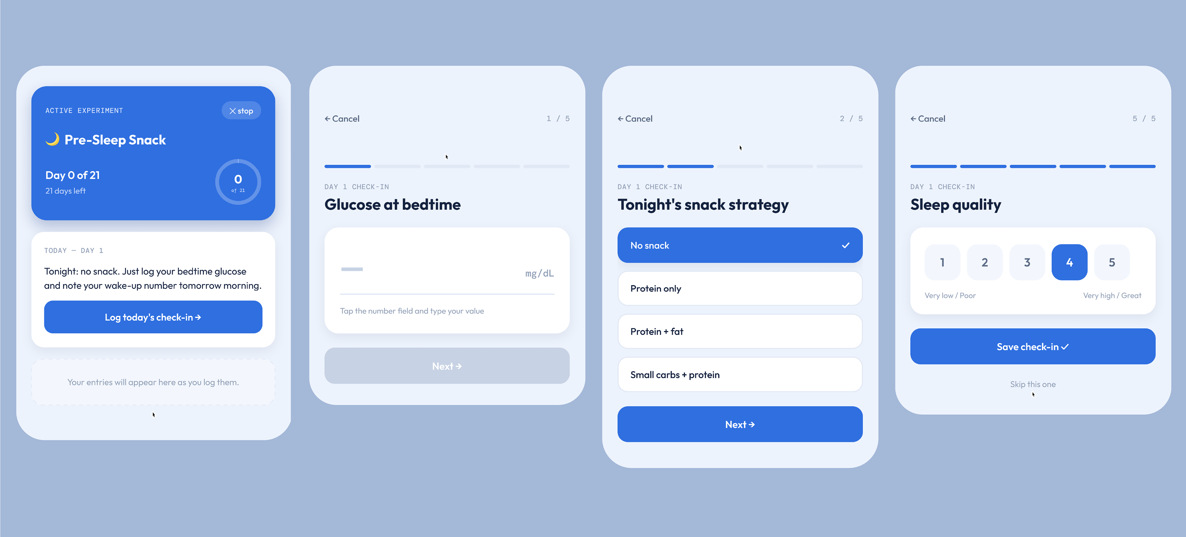
The check-in is one question per screen across five steps — a number, a set of option cards, a free-text field, another number, a 1–5 scale — with a segmented progress bar, and "skip this one" on every optional step.
The active experiment screen shows a single card: which day you're on, what tonight's condition is (Tonight: no snack), and one button. The protocol tells you what to do, so you don't have to remember where you are in the cycle.
5. Let people describe the problem in their own words
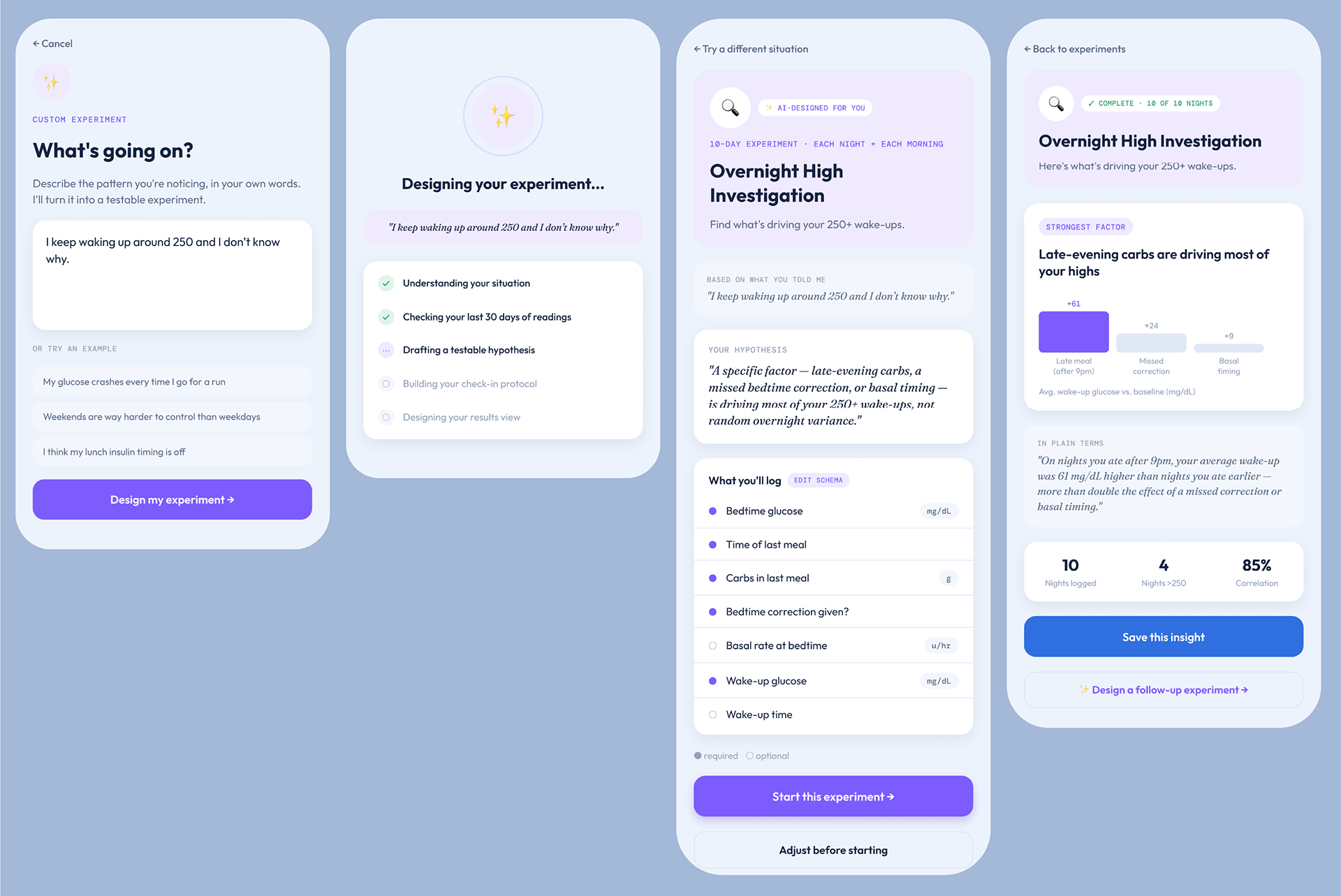
Not every question fits a pre-built protocol. Using AI, the custom flow takes a plain-language description — "I keep waking up around 250 and I don't know why" — and returns a designed experiment: a 10-day protocol, a hypothesis, a logging schema, and a defined result view.
The design keeps the user in control of the generated experiment, providing options to "Edit schema" and "Adjust before starting", and quotes the user's original sentence back, so they can check that the system understood them before committing to it.
The result screen ranks the tested factors by effect size (+61, +24, +9 mg/dL) and restates the finding in plain language: "On nights you ate after 9pm, your average wake-up was 61 mg/dL higher than nights you ate earlier."
6. Hand off to the clinician
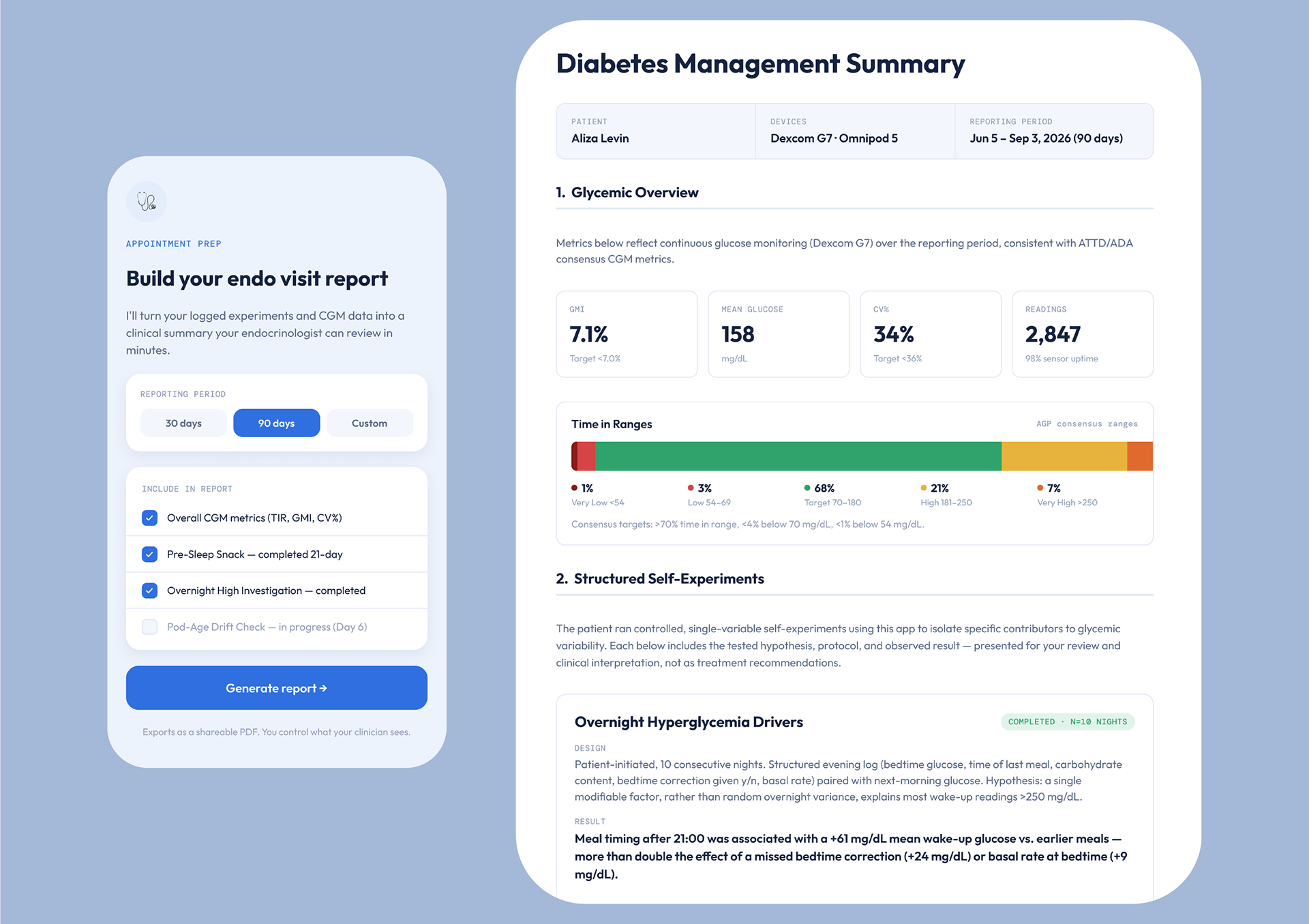
Appointment prep compiles a print-format clinical summary: standard CGM metrics (GMI, mean glucose, CV%, time-in-ranges against AGP consensus bands), then each self-experiment written up as design, result, and interpretation, then a summary table and four discussion topics.
These aren't meant to be strict health directives, so it is just about showing app interpretations and data without using a clinical voice.
What I left out
Scoping this concept was mostly about deciding that we don’t need another diabetes app like the ones currently out there. They already solve the problem in an established way.
Figma Make and Claude Design both proposed a ton of features. I had to remove summary dashboards, duplicate values from manufacturer diabetes apps, and general logging. My premise is that undirected capture is a burden. Having a place to log everything just weakened the concept.
I also removed predictive low alerts and bolus suggestions. Dexcom and Omnipod already do both. It doesn’t make sense in another app.
Another common AI feature is a general chat interface. I removed this because open-ended chat is another one of those general, non-purpose features like generalized logging. It puts the burden of knowing what to ask back on the user and would not be helpful in this context.
The obvious thing to build with an LLM would have been a feed of AI insights. For example, a running stream of observations about your data, refreshed daily. However, someone managing T1D already has a CGM talking to them all day. Adding a second voice with opinions isn't help, it's more data anxiety. So the intelligence in Fieldnote surfaces only at three moments: once at onboarding, once when an experiment is proposed, and once when it ends. The rest of the time the app is quiet.
Designing with AI
The project was a way for me to work through how much the design process changes when you design with LLMs since I have not designed an app 0 to 1 with these new tools.
Where it helped
Generating first concepts in Claude Design and Figma Make let me get a full working direction in front of me in hours instead of days. Getting to this level of fidelity so quickly let me evaluate much quicker than even sketching low fidelity prototypes. And throwing away a logging app I'd spent a week on would have been a much harder decision. The experiment content, such as protocol lengths, which variables each hypothesis requires, what the result view should show, was drafted fast enough that I could evaluate ten experiments instead of designing two. It helped me populate realistic content and do desk review research in a tenth of the time its taken before.
Where I had to steer
In general, AI tends to default to more: more fields, more insights, more screens. Nearly every design decision became about subtraction (though also working with AI makes it easy to explore hunches). AI also tends to default to overclaiming and strict conclusions. The confidence labels, the sample sizes, and the patient-generated framing on the clinical report are all constraints I added, because it's important to understand finding vs. suggestion in a health product.
What I'd tell another designer
AI's value is about building a direction far enough to find out it's wrong, and still have the appetite to start over. In design school, we called this eating the delicious apple, which is about discarding that initial idea. Working with AI is like working with someone who has really strong opinions and is an eloquent speaker, so everything initially seems like a great argument. You have to have a strong point of view yourself and be able to articulate your point of view to yourself, and to the AI agent.