Role: Founding Designer, then Product Design Director
Dates: 2012–2026
Platform: Android, offline-first, FHIR-native
Outcome: 90+ implementations globally, 1.6M services recorded, 235K patients enrolled, 3,500 frontline users
Dates: 2012–2026
Platform: Android, offline-first, FHIR-native
Outcome: 90+ implementations globally, 1.6M services recorded, 235K patients enrolled, 3,500 frontline users
OpenSRP is a configurable mobile health platform for frontline health workers, built for low-connectivity, low-resource conditions. In 2022 we partnered with Google to rebuild it on FHIR, making it one of the first FHIR-native health apps in the world.
My Role & Process
OpenSRP is implemented by in-country partners in their own health systems, so the platform had to support a wide range of use cases rather than one fixed workflow. I ran human-centered design sessions with the World Health Organization to ground the work in global health standards, and with in-country health ministries and NGOs such as Last Mile Health in Liberia, mPower in Bangladesh, IRD in Pakistan, and SID in Indonesia, to understand how those standards actually played out on the ground. We iterated until the tools fit how those teams actually worked, and kept iterating as health data standards changed through the 2010s.
I led the initial product vision and interaction models for the platform, working from the ground up with frontline-worker users rather than designing for them remotely, and designed for the realities of the environment. The primary design challenges were the realities of networks, users, and adoption. Technically, we had to ensure usability in low-connectivity conditions where a typical always-online pattern would fail, which impacted what we could do in the app.
How do you design a smartphone app for someone that has never used a smartphone?
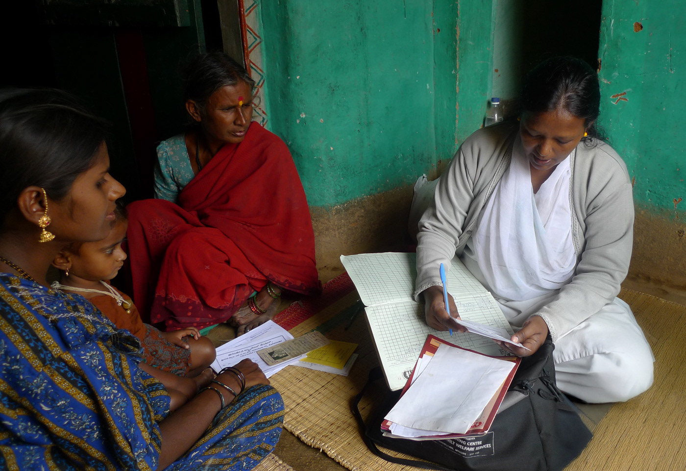
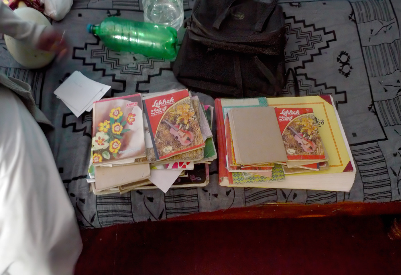
Research started in 2012 as a small pilot project in Karnataka, India. We found outreach nurse midwives carrying stacks of registers and notebooks, which made health data inaccessible to health systems.
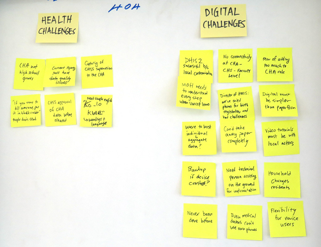
After the pilot in India, it was clear a digital system for frontline users had potential. We gathered partners from WHO with ministries and health experts from Pakistan, Indonesia, India, Bangladesh, and Kenya to set a vision for the app. As we designed, we were able to work with these partners to quickly validate solutions with real users in the field.
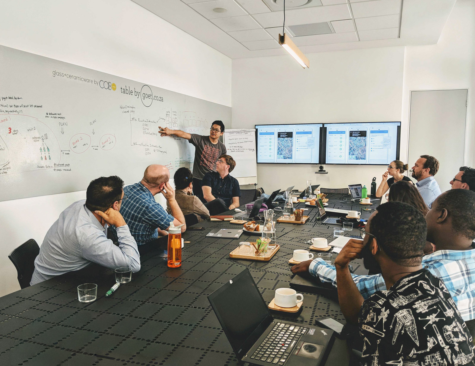
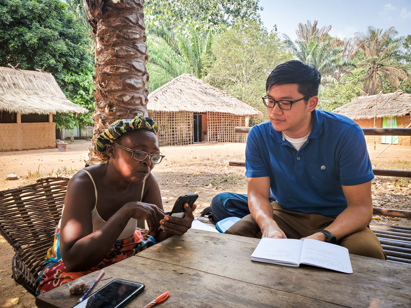
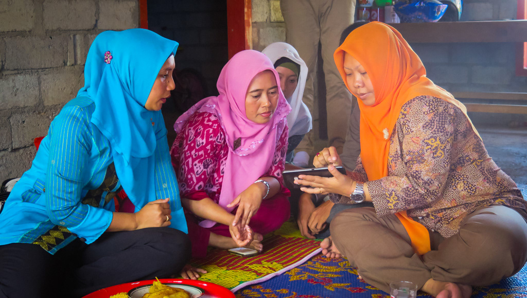
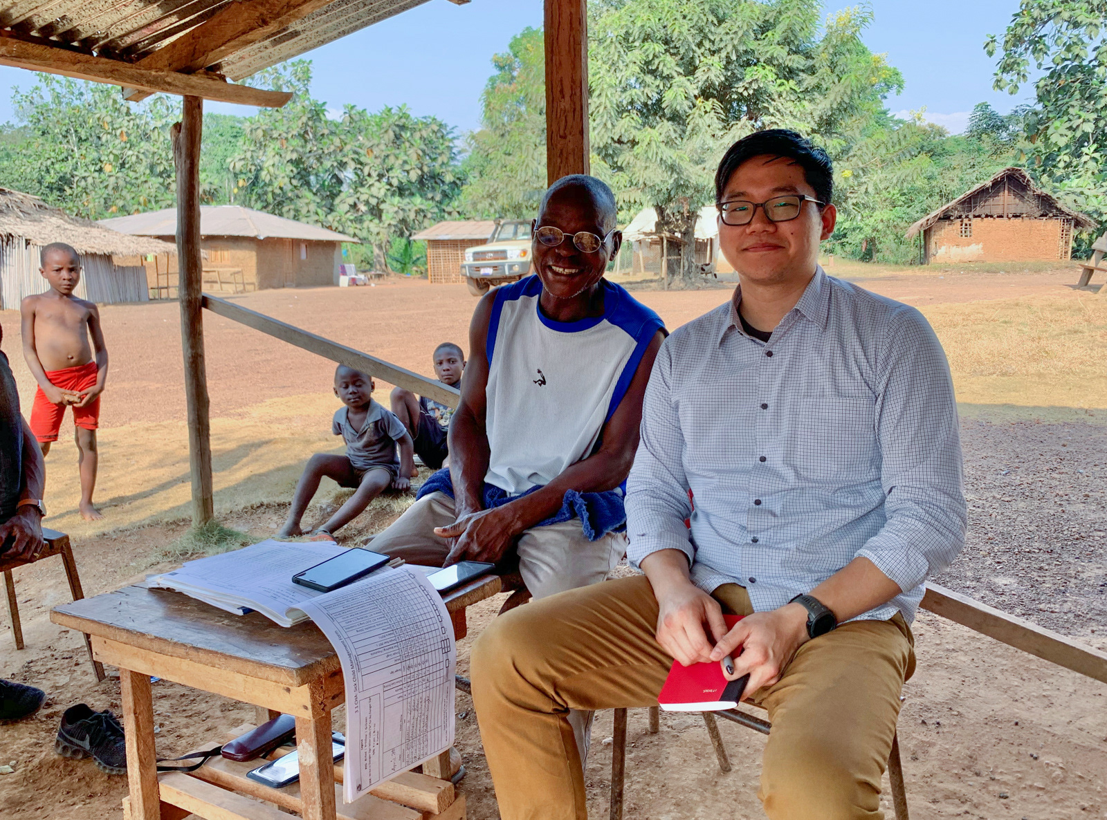
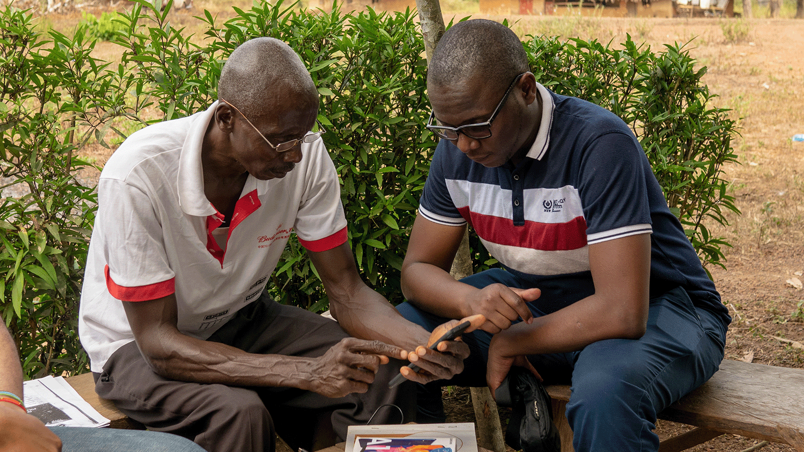
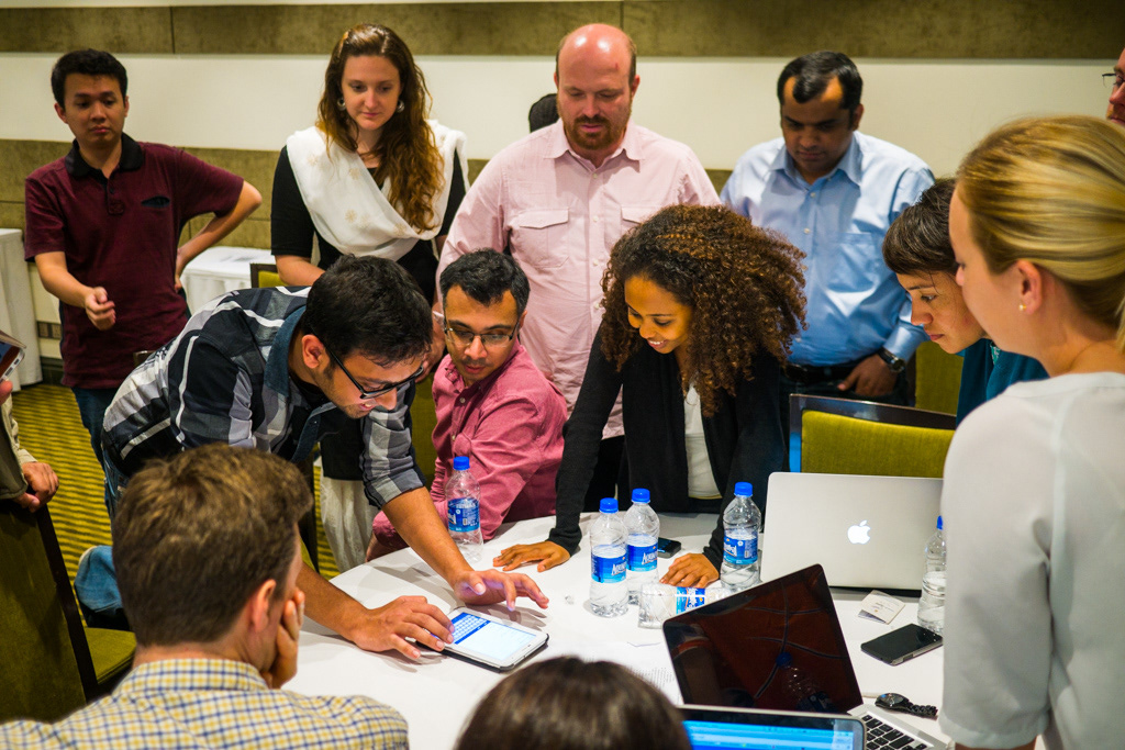
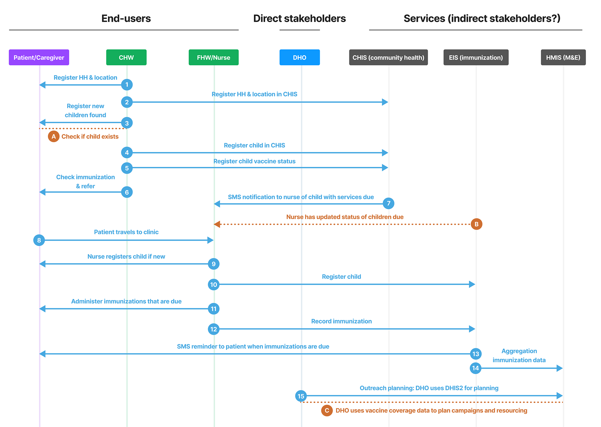
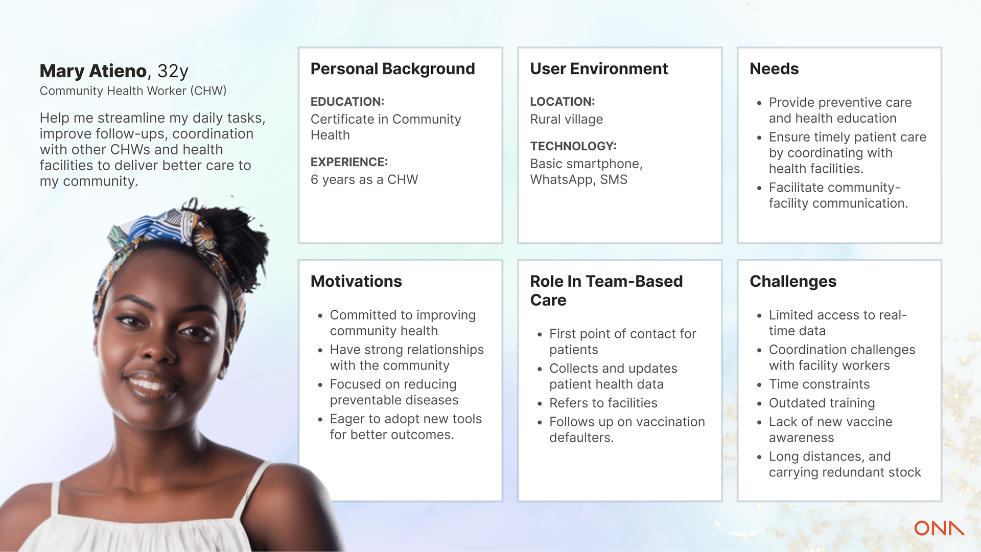
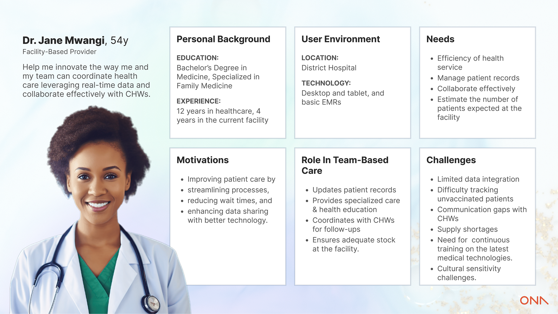
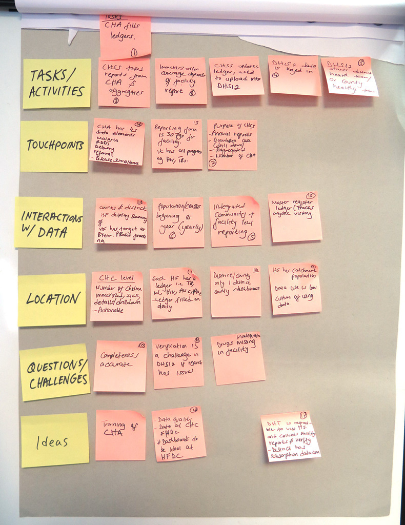
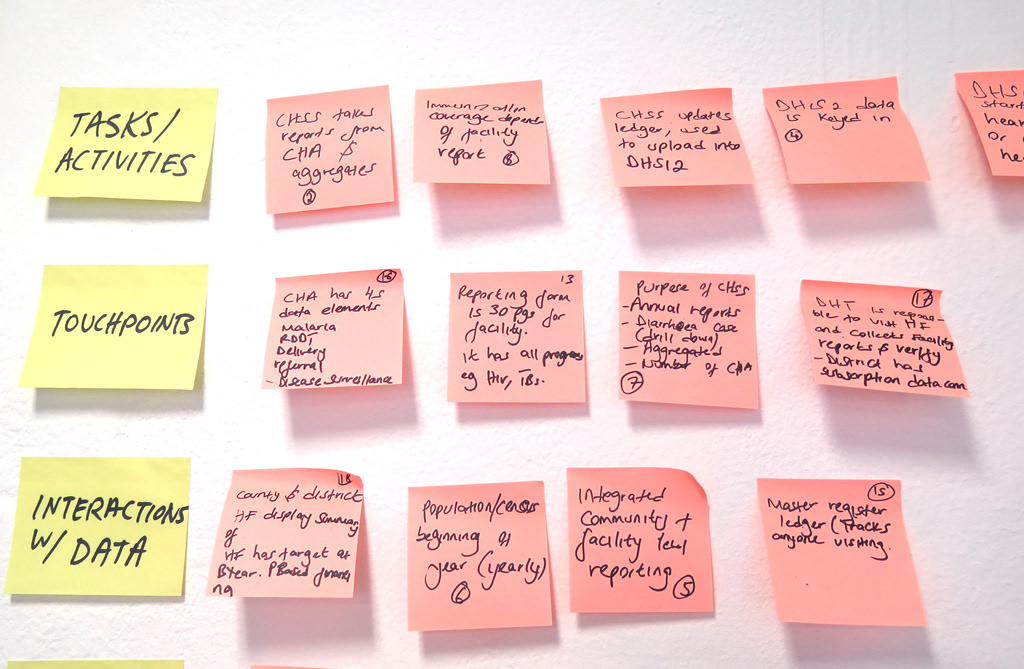
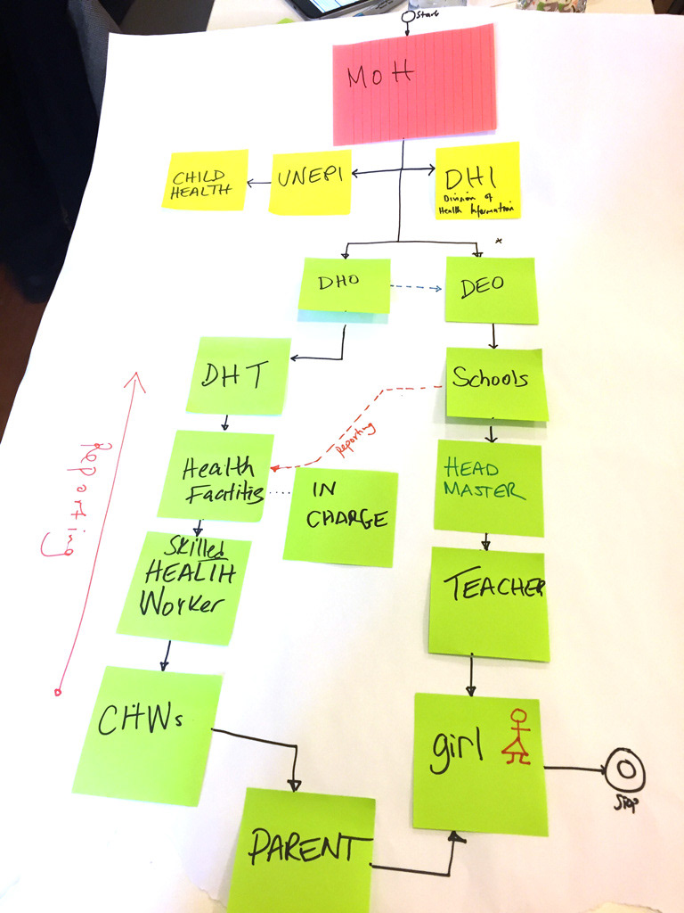
Because we were bootstrapped, we improved the product, project by project, as it was implemented in local health systems. We created and adapated artifacts such as journey maps and user personas as the use cases changed. During this time, I kept a close read on every OpenSRP project we ran, and set up a coordination system with partners running their own instances, which let us prioritize against needs a year out rather than the current request queue.
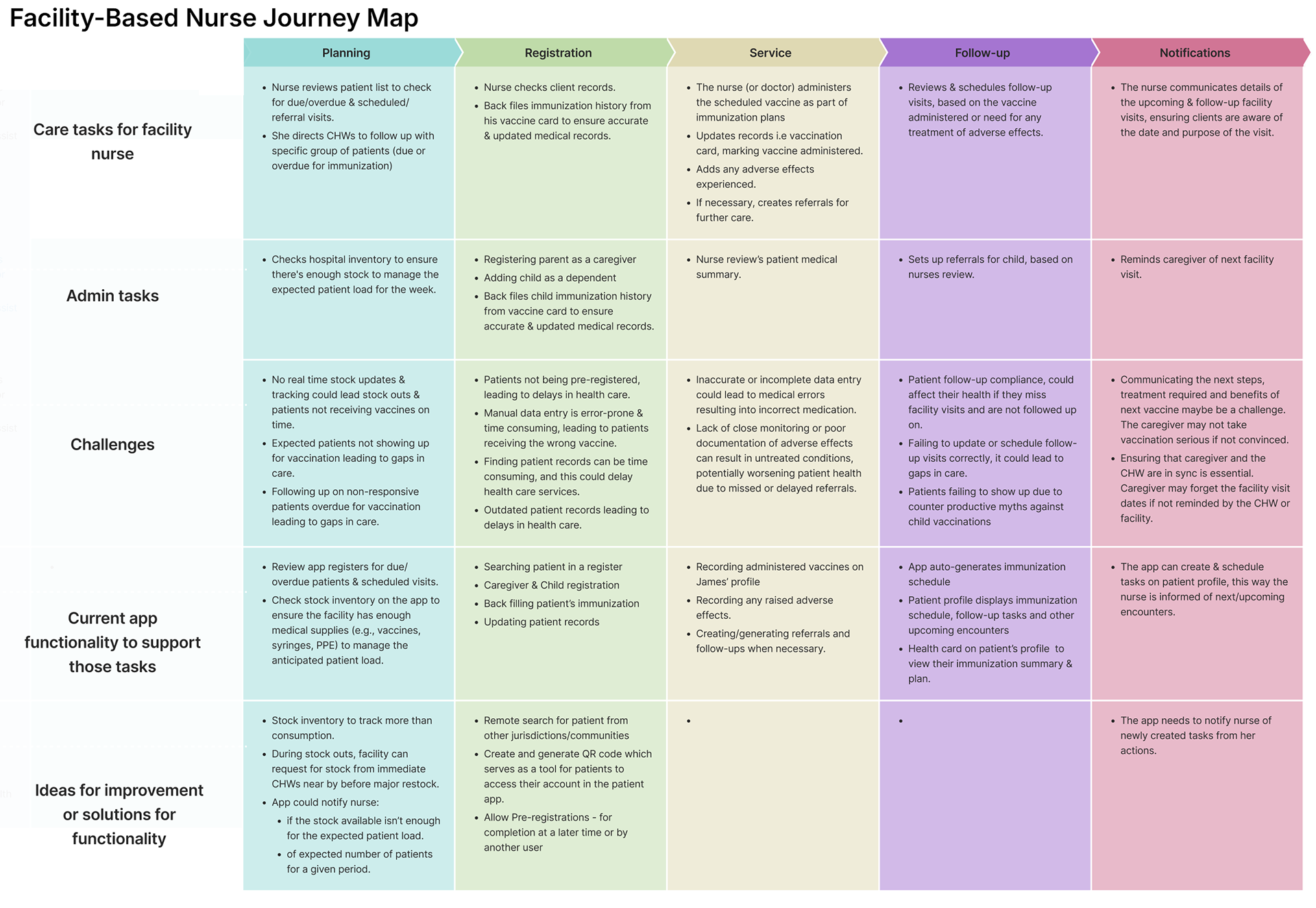
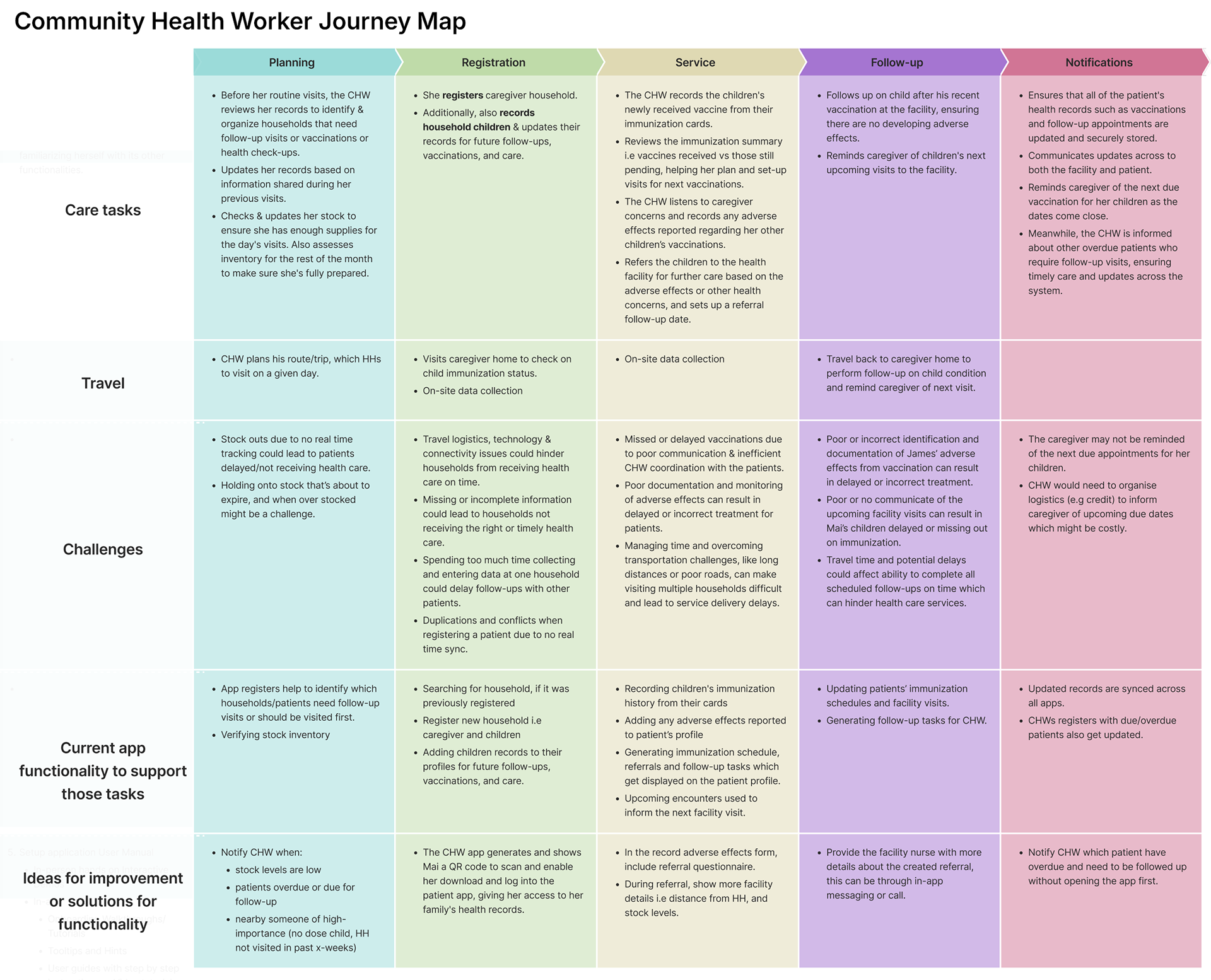
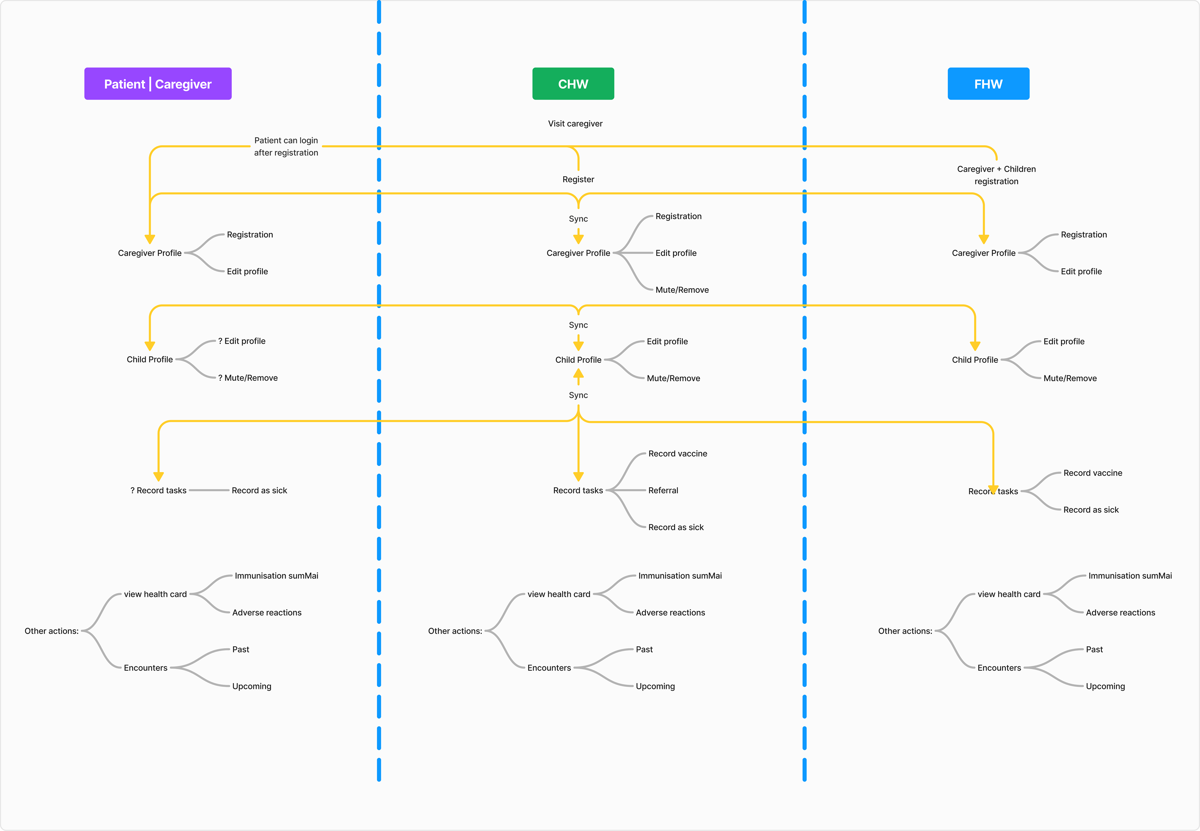
Design
Skeuomorphism
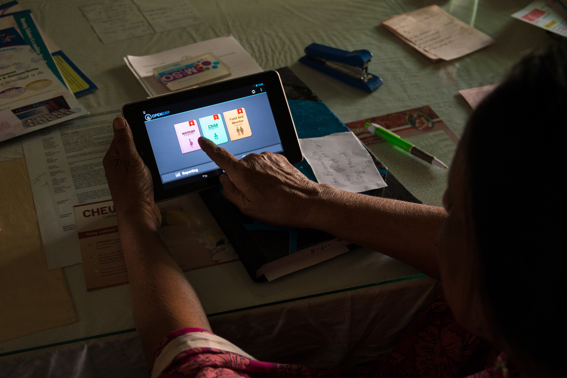
Early on, many users had never touched a smartphone, so I designed around metaphors from their existing paper practice: a home screen built as a stack of books, since our users carried a literal stack of ledgers to record data. Opening a "book" revealed a tabular ledger, improved with color-coded flags, and medical records were visually modeled on the mother-and-child passport cards field teams already used. As smartphone use and digital literacy grew, I shifted the design language toward patterns people already knew from WhatsApp, Facebook, and YouTube — trading physical-metaphor familiarity for fewer taps and more direct value, once that tradeoff made sense.
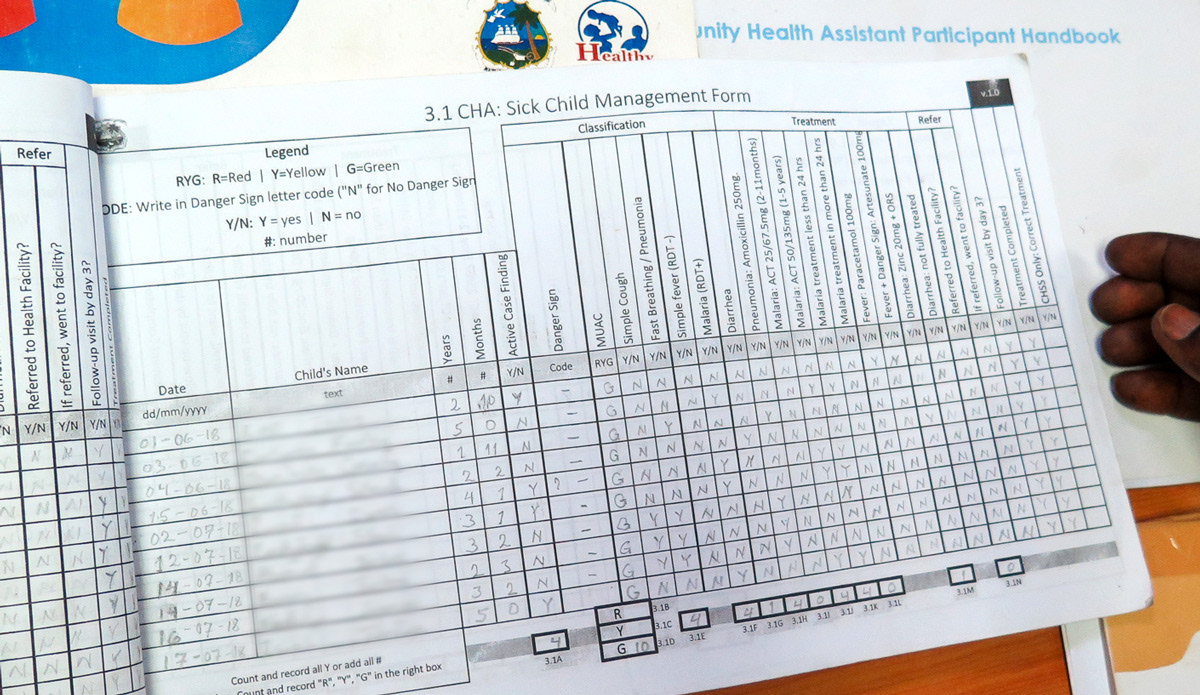
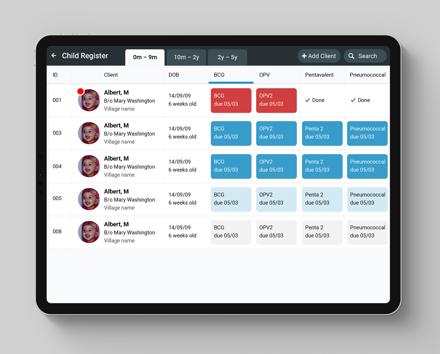
Paper registers inspired the layout of the digital register in order to make onboarding easier for new-to-smartphone users.
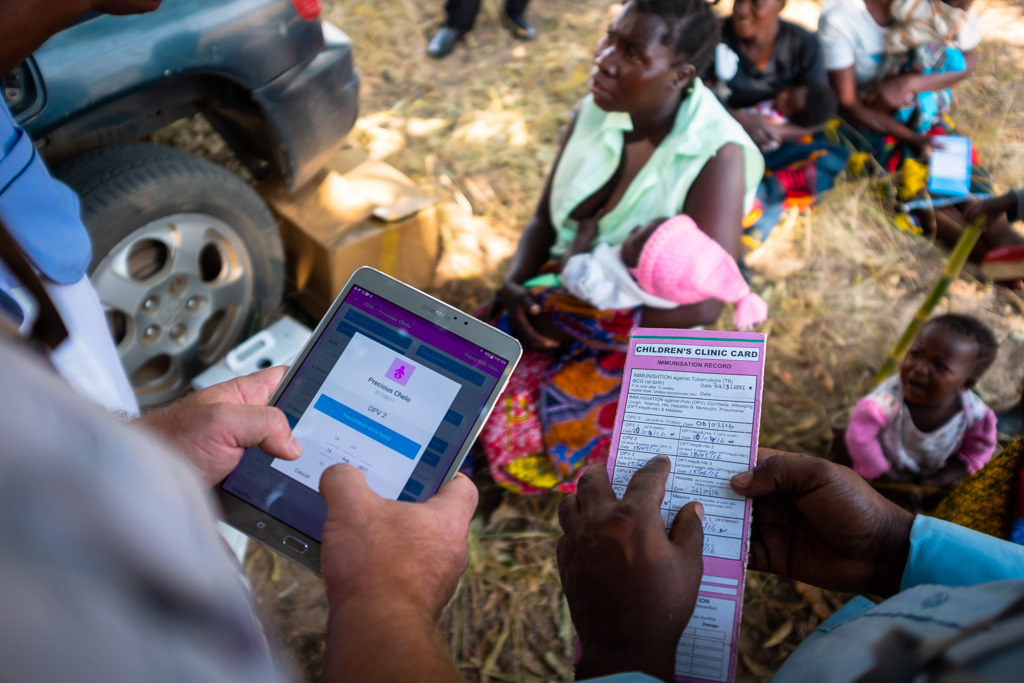
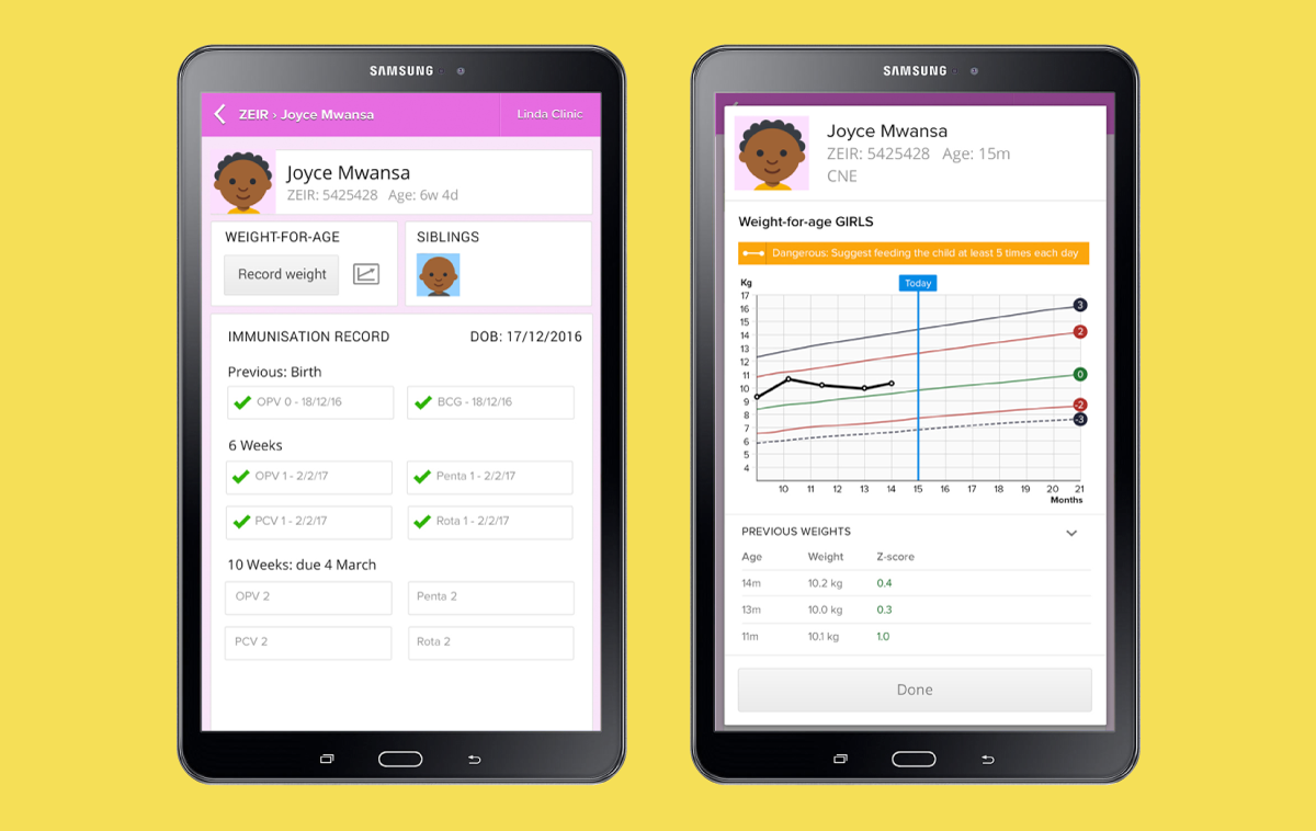
Digital medical records mimicked the child health cards that mothers carried around.
Accessibility as a field condition, not a checklist
Our users were reading screens in direct sunlight, often one-handed while holding a register, a phone, or a child. Many had low digital literacy and no one to ask for help. Every one of those is an accessibility problem, and none of them show up in a compliance audit.
So I designed to the condition: high contrast that survived glare, tap targets sized for one-handed use in motion, focused single-purpose input widgets instead of dense forms, and iconography and color-coded flags that carried meaning without depending on reading fluency.
That framing carried into the component system. Because implementations assembled the same view types differently, accessibility had to live in the components rather than in any one screen — otherwise every new country implementation would have changed it.
Modular design system
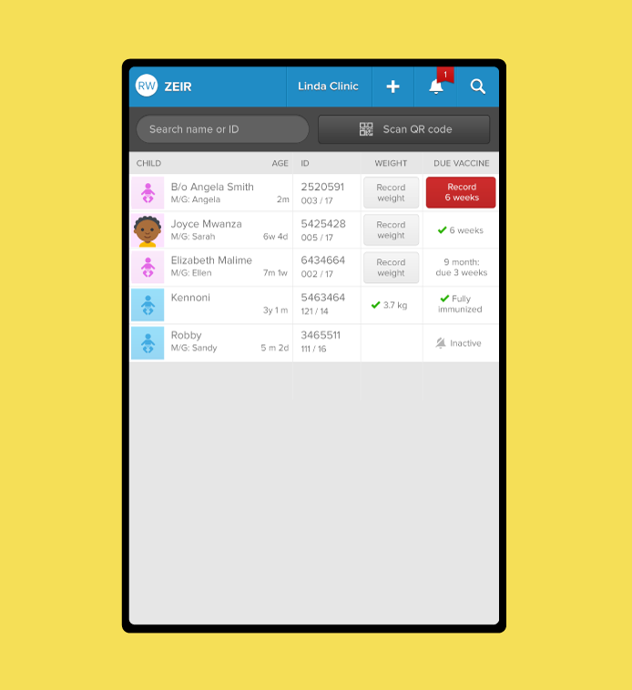
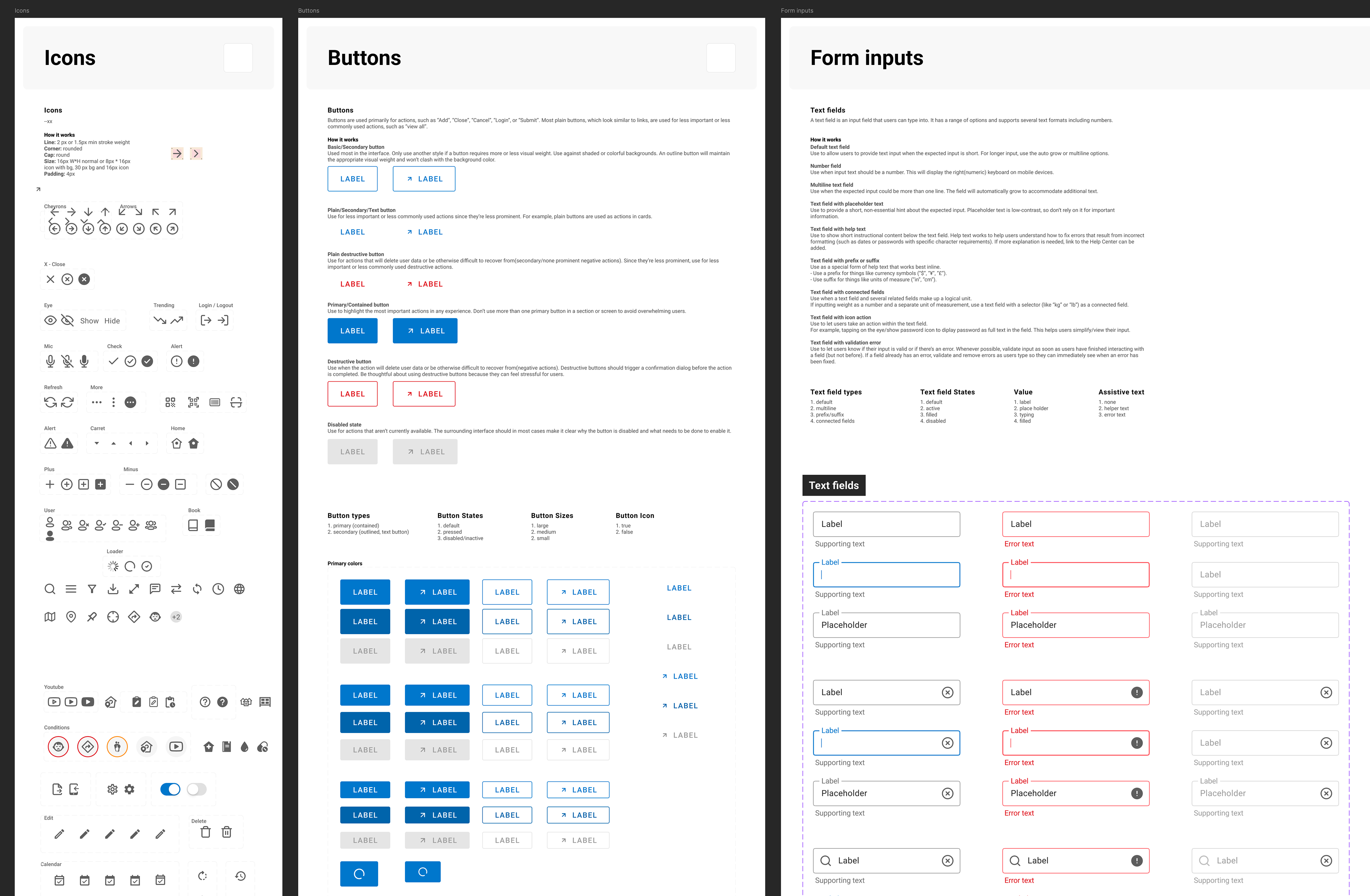
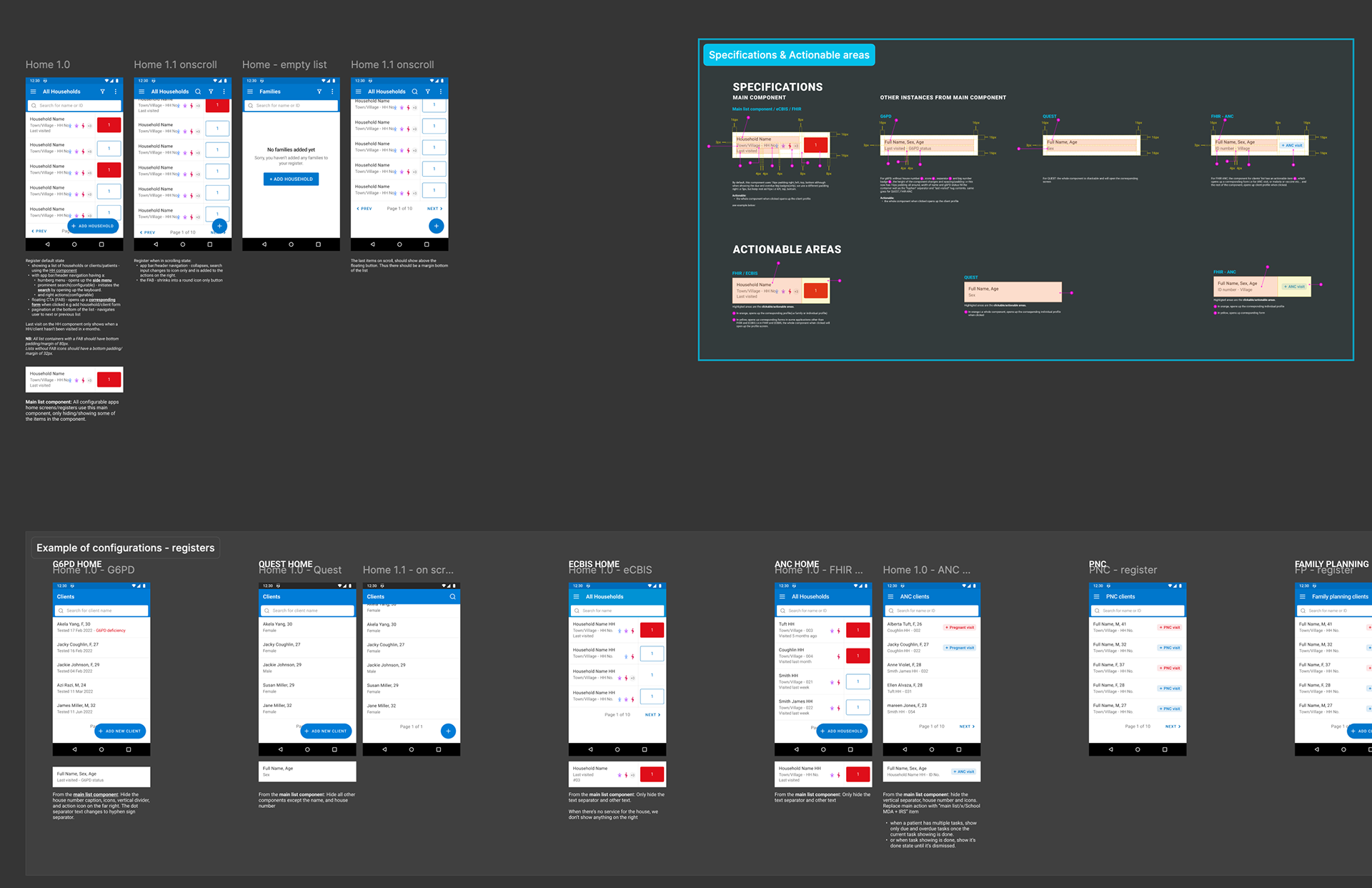
The platform's flexibility came from a component system built directly on top of FHIR health data resources, rather than designing one-off screens for each country. My team, partners, and I collaborated on a shared set of view types any implementation could assemble differently — a landing register list, a profile view, a past-encounters view, maps, charts, and forms — held together by a general style guide and a consistent metaphor: a register of profiles you tap into, forms that collect the data, and a profile view that surfaces it back in whatever way a given health program needed. Flexibility wasn't spread evenly across those views: the landing view and profile view carried the most room to vary, since that's where implementation needs differed most from country to country, while forms and charts stayed closer to a standard pattern.
When a new implementation came in, we worked directly with in-country teams to build mockups from our design system's templates, which engineers then built out — so a person with design judgment was in the room for every new country, not just engineering assembling components on its own.
The design system is available in the Figma library.
AI and OpenSRP
Health workers struggle to get data into digital health record systems — a problem even in the US. Simplifying forms only goes so far when the person holding the phone has never held one before, so in 2016 I proposed a listener mode for the app. The technology finally caught up, and we planned and tested a prototype: Elle, an ambient device that sits in a rural health center and listens to clinical visits. Elle classifies the visit type, marks which data points the worker captured and which guidance they missed, and returns suggestions measured against the protocol. The concept now waits on funding for a pilot in Bangladesh.
I also led UX design on True Cover, an AI tool built with UNICEF and UCSF epidemiologists that identifies structures from satellite imagery, estimates population, and selects which households to sample based on risk, terrain, and distance from care. I designed an interface with the agent as it reasoned through the plan, and designing how its output became a usable field work plan for a team of enumerators. The project lost funding before the design was built.
Stakeholders Galore
A health worker, her supervisor, the NGO running the program, the ministry that owned the policy, the funder paying for the round, and our product team all wanted something different from the same screen, and none of them outranked the others.
Subsequently, my process involved identifying the day-to-day decision makers in each implementation within the first few weeks, then bringing them to the field. Watching a health worker run a postnatal check with a toddler pulling at her leg does what no user persona could do.
Five minutes at the household means a max of two minutes for using the app. That target became the decision maker to avoid scope creep.
Every implementation wanted more fields — indicators for the ministry, evidence for the NGO, attribution for the funder — and with nobody holding an editorial line, the form just grew. Five practices kept the form and the app focused:
• Name the editor out loud. Appoint one content owner per form, by name, in writing. People accept a gate when it's a person with a title.
• Instrument the rule. Log median time-on-form and review it monthly. "This form is at 3:10" ends a discussion whereas "it's too long" is a slippery slope.
• Make additions zero-sum. Anyone proposing a field names the field it replaces. This prevented many new requests.
• Bring the field to the decision makers. Ninety seconds of video from a real visit becomes a useful artifact to replay to bring reality into the conversation.
• Time-box consultation. The broad-sign-off group wants to be informed. I was able to give everyone a chance to speak up by reminding them, "We ship this week unless I hear otherwise."
• Instrument the rule. Log median time-on-form and review it monthly. "This form is at 3:10" ends a discussion whereas "it's too long" is a slippery slope.
• Make additions zero-sum. Anyone proposing a field names the field it replaces. This prevented many new requests.
• Bring the field to the decision makers. Ninety seconds of video from a real visit becomes a useful artifact to replay to bring reality into the conversation.
• Time-box consultation. The broad-sign-off group wants to be informed. I was able to give everyone a chance to speak up by reminding them, "We ship this week unless I hear otherwise."
Outcome
The platform reached 90+ implementations globally, recording 1.6M services and enrolling 235K patients across 3,500 frontline users. That reach came from building with local partners rather than shipping one fixed design to everyone. Our flexible technology and design gave us options to tailor implementations for each health system, shaped by the needs and constraints unique to it.
Interesting use cases included:
• Supply status tracking with UNICEF Madagascar
• Refugee-in-transit health tracking in Europe with Doctors Without Borders
• Indoor residual spraying in Zambia with Akros
• Child health in Liberia with Last Mile Health
• Maternal and child health in Lombok, Indonesia with SID
• Mental health management in NYC with NYSPI
• Supply status tracking with UNICEF Madagascar
• Refugee-in-transit health tracking in Europe with Doctors Without Borders
• Indoor residual spraying in Zambia with Akros
• Child health in Liberia with Last Mile Health
• Maternal and child health in Lombok, Indonesia with SID
• Mental health management in NYC with NYSPI
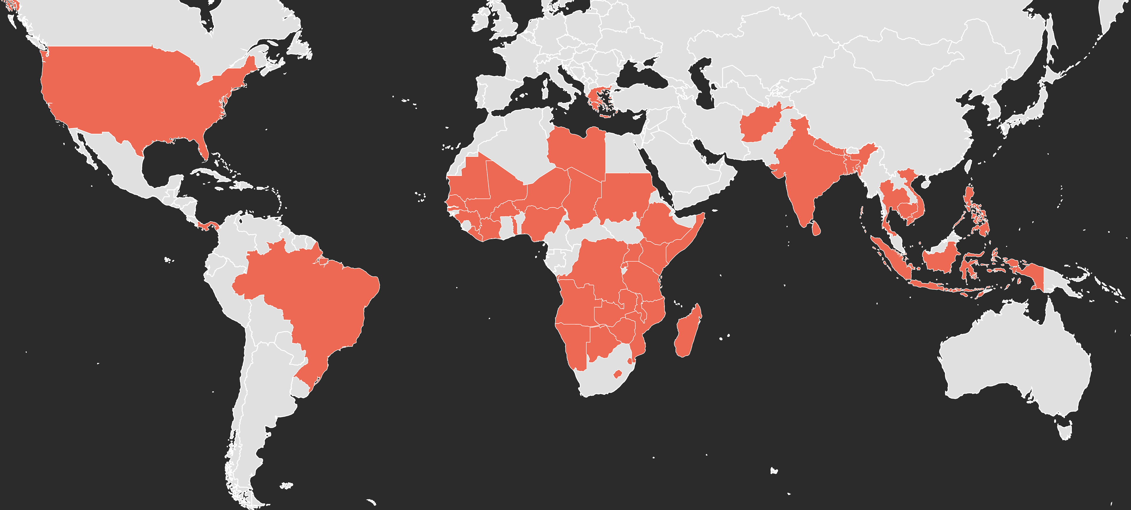
Countries where OpenSRP had an implementation or pilot
In 2023, we collaborated with Google on Open Health Stack and rebuilt OpenSRP from the ground up to be FHIR native. This modernized the app to more easily work with multi-stakeholder health systems and databases.
Google-produced looking at OpenSRP and Open Health Stack
Reflection
Ten years on OpenSRP taught me two things. First, a product like this only works if design, policy, and engineering solve the problem together. The tool supported a job far larger than what the app itself did, so understanding where it fit into that bigger picture was what let us set the right goals and constraints. Second, getting the launch right matters as much as getting the product right: buy-in from managers, a support plan, training, and providing incentives to reward users and beneficiaries were as much a part of the design work as the app UI.
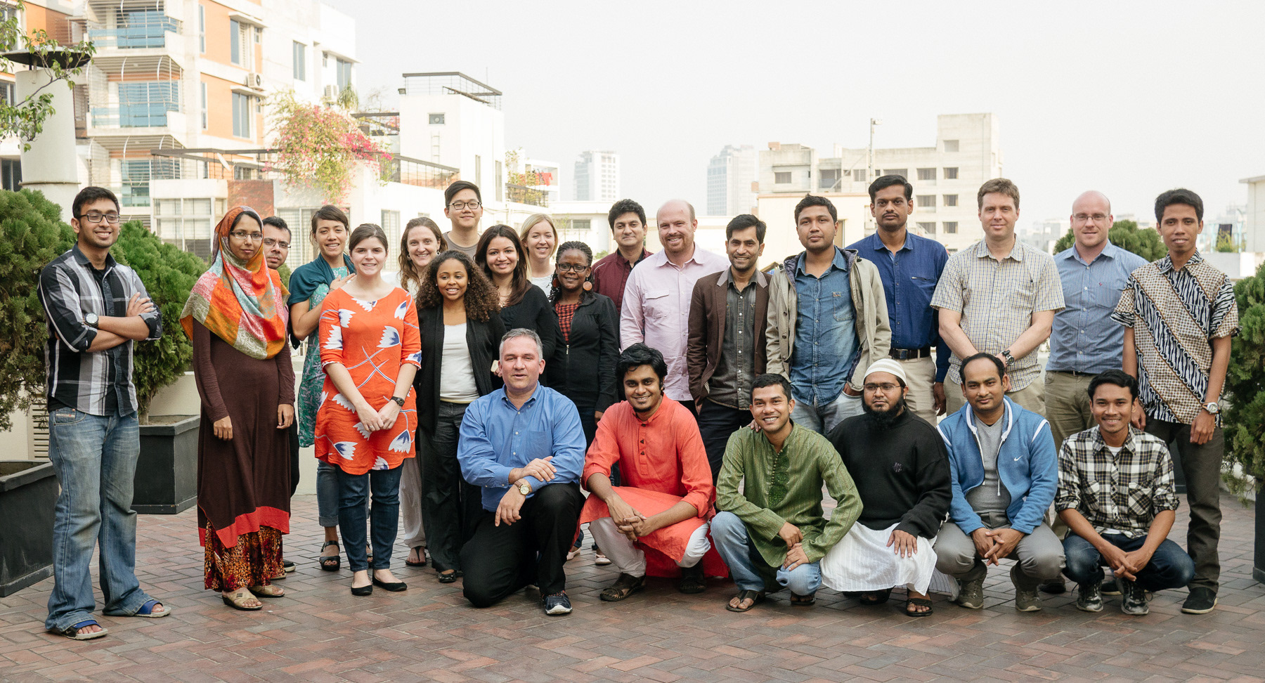
Early OpenSRP partners meeting in Dhaka, Bangladesh
Role: Design Director and IC