
Case Study

Open Smart Register Platform
A mobile health platform for frontline health workers, designed over ten years and eighty implementations.
Quick Take
Objective
Community health workers around the world ran their programs on paper registers that recorded a visit but couldn’t help with one. Most had never held a smartphone, and every ministry, NGO, and funder wanted something different from a digital system.
Execution
Led design on every OpenSRP module over ten years — immunizations, maternal health, diabetes, TB/HIV, a health-worker chatbot — on a component system that in-country teams used to stand up their own implementations, and held scope against one rule drawn from watching real visits.
Results
1.6 million services recorded for 235,000 patients across eighty implementations, and new deployment time cut from three-to-six months to four-to-six weeks.
I
Problem


A community health worker is the whole health system for the families on her list. She knows which child is behind on immunizations and which mother is close to term, and she carries all of it in a paper register in her bag.
Look at what that register actually does for her, though, and you find it was never built for her. It was built for the people reading it later. Totals were copied up to the clinic, keyed in weeks after the visit, and nothing ever came back down. She wrote the record. She got the least out of it.
10 minutes at a household
3 minutes available for an app
I led design on OpenSRP, which started from a simple bet: the register itself should be the tool. An app that knows who is due, what was missed, and what to do next. That bet ran into two hard facts immediately. The users had never used a smartphone, and the visit lasts ten minutes. Every design decision for the next decade was an argument about what fits inside the three minutes the app gets.
II
Approach
Who the ten minutes actually belongs to
I brought the primary decision makers into the field to watch a real visit, because the number that came out of it would decide everything else. A household visit runs about ten minutes, which leaves roughly three for the app, and that is generous. The reason it needed defending is that ministries tend to see community health workers as free data collection — the visit is expensive and already happening, so why not attach something to it. We were asked for latrine and well-access status, socioeconomic classification, and in one case a full civil registry recording every person in a household. None of it helps her decide anything at the door, and every question she can’t use is one more reason to stop answering carefully.
Translating paper without translating its logic
On paper, a checklist of negative symptoms is scannable: a worker takes in twenty items at once, confirms what she already observed, and moves on. Translate that literally into a digital form and she walks through twenty sequential screens to record twenty things that aren’t happening. The paper version took seconds, the faithful version takes minutes, and the design job was to notice the difference before shipping it.
Nobody could approve anything
Every implementation had a health worker, a supervisor, a funder, an NGO, a ministry, and our product team, all wanting something different from the same screen and none of them outranking the others. I learned to find the day-to-day decision maker fast and take approval there, and to identify who only needed broad sign-off so they weren’t pulled into field-level choices. The national ministry was always the hardest room, because in a hierarchical system one senior preference becomes a requirement before anyone asks whether it survives a doorstep. Nothing I said in that room moved anyone — what moved them was watching a real health worker walk through a visit, or a role play, or failing that a video. The constraint has to be witnessed, not argued.
The first phone anyone had held
Most users had no smartphone vocabulary at all: no expectation of what a tap does, what a list means, or where to look first. So I built the interface out of objects they already carried — a home screen of stacked ledgers, patient records styled like the mother-and-child passport cards families kept at home, registers laid out as tables with color-coded flags so status read at a glance. Data entry ran through custom input screens built for each kind of value rather than generic form controls, because a generic field costs taps and taps cost minutes.
Then the metaphors expired
The physical language worked, and then it stopped working. Within a few years those same users had WhatsApp and YouTube on their own phones, and a stack of books is slower than a list once you already know what a list is — it mirrored the ledger faithfully, including the part where you page through a fixed order instead of searching. The forms aged the same way: paper always shows every question, so our first digital forms did too, until users fluent in smartphones let us introduce skip logic and show only what an answer made relevant. I retired the design language I had built and moved toward the patterns people had learned on their own time.
The system I couldn’t have designed on day one
For the first few years I designed implementations one at a time, and each one taught me how a health system actually differs from the one before it. That stretch is what made a design system possible, because only then could I see which parts genuinely vary — who is on a register, how they’re triaged, what a program is trying to catch — and which only appear to, like what a clinical form or a chart needs to do. The design system that came out of it put the landing view and profile under local control and held forms and charts fixed, and from then on I built mockups with in-country teams from its templates. That changed the conversation from “what should this look like” to “which of these does your program need,” which is why one product served eighty programs instead of becoming eighty products.

Mandatory fields were never a UI problem
The registers I watched in use had gaps everywhere — workers filled in what mattered in the time they had and moved on — while the standards those same workers were measured against assumed every field on every visit. The request that came back every year was to make fields required so the data would arrive complete, and I argued the other way every time. A required field doesn’t create time at a doorstep; it moves the cost onto the health worker, and when the field is wrong for the visit she enters something false to get past it. Completeness was a care-model decision needing supervision, training, and incentives behind it, not a validation rule in front of it.
Making something come back down
The original failure was that nothing returned to the person holding the record, and the clearest fix was the monthly report: two to three days of hand-tallying every month, replaced by a document generated from visits she had already entered. From there we shipped the things that pointed data back at her rather than up the hierarchy — lists prioritized by risk so her day followed who needed her most, one-tap check-ins so proving she’d worked no longer cost a full form, referral loops that told her whether the patient she sent to the clinic actually arrived, accomplishment views, peer chat, and supervisor review built as a conversation rather than an audit. A field that only feeds the hierarchy is a tax. A field that returns an answer is a tool.
Rebuilding FHIR-native with Google
We rebuilt OpenSRP with Google as one of the first FHIR-native applications of its kind, now part of Open Health Stack. With the updated design system and prototypes that behaved like the production app rather than slides describing it, new implementation time fell from three-to-six months to four-to-six weeks.

III
Outcome
KEY STATS
SCALE1.6 millionServices recorded for diabetes, child and maternal health, HIV, etc. | REACH80+Implementations across Africa, Asia, and the Americas | SCALE235,000Patients, including refugees, migrants, hard-to-reach populations, and residents of New York City | TIME5 minMonthly report prep, down from multiple days, after paper records were digitized |

OpenSRP is in the hands of health workers across the world. It was rebuilt with Google as one of the first FHIR-native applications of its kind and is now part of Open Health Stack, and the standards work ran through a partnership with the World Health Organization. Ona was named one of TIME’s 50 Genius Companies during this period.
“The register stopped being something she filled in and became something that answered her.”
The number I care about most is not in that table. New implementation time fell from three-to-six months to four-to-six weeks, because the design system handed in-country teams a set of templates instead of a blank page, and because prototypes that behaved like the real app replaced rounds of written requirements.
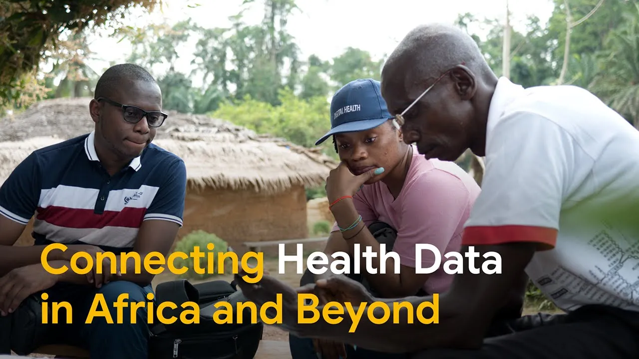
Google-produced video about OpenSRP
What I Learned
AN INTERACTION LANGUAGE IS ALWAYS BORROWED
I built the first one out of objects people already carried, and it worked until it didn’t. Smartphone literacy moved faster than I expected and I held those metaphors about a year too long. When the place you borrowed a language from changes, you give it back.
SOME DESIGN PROBLEMS ARE POLICY PROBLEMS IN A UI COSTUME
Mandatory fields looked like a validation question for a decade and never were one. Knowing which arguments cannot be won inside the interface is what kept me from shipping a form that would have been filled with false data by the people it was meant to help.
Team
2 designers; 5 PMs; 12 engineers; account management; open source community
Role
Product Design Director
Expertise
Health 0-to-1 / Research / Product Strategy / Design
Highlight
80+ implementations all over the world